If you’ve not heard of Elevation Church by now then you really need to look them up! They’re leading the way in church media and are regularly producing professional videos over on their Vimeo channel. Today, we’re going to take a look at the homepage of their website and see how they’re making a big impact on the world wide web.
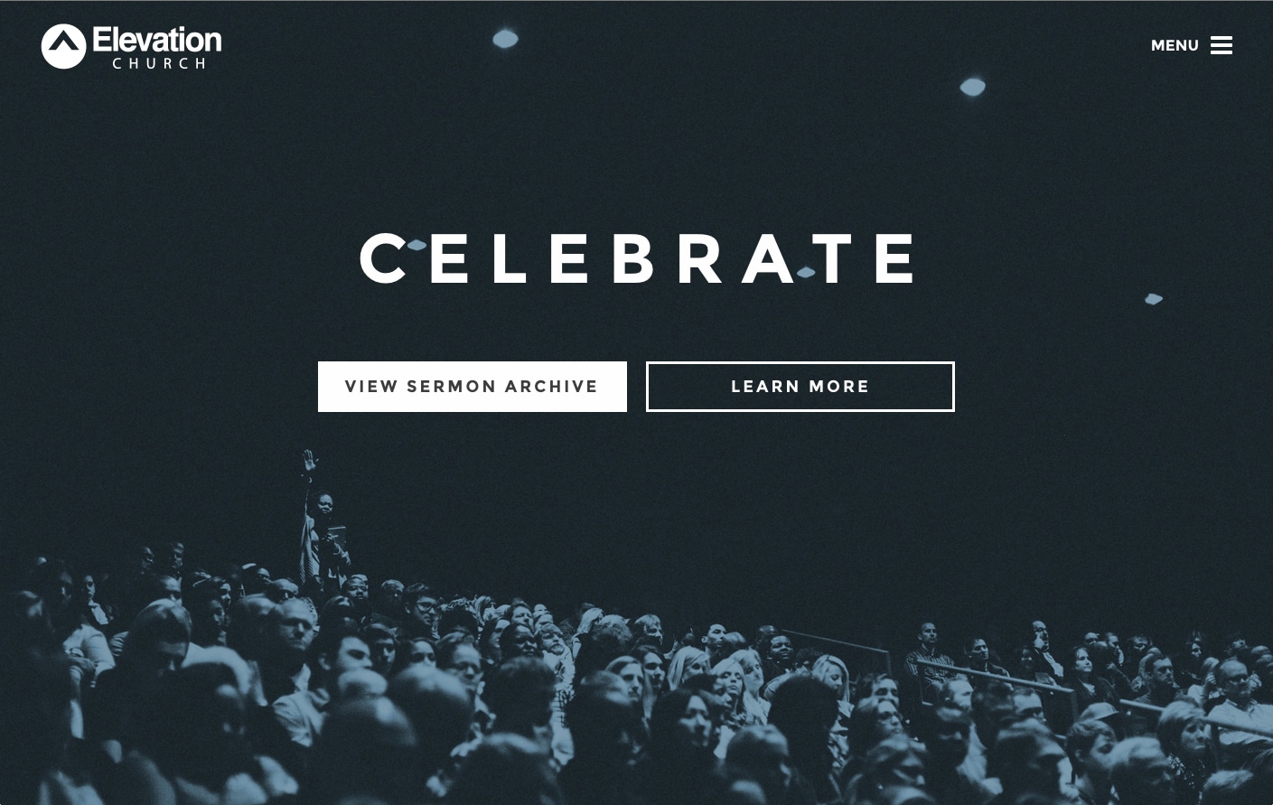
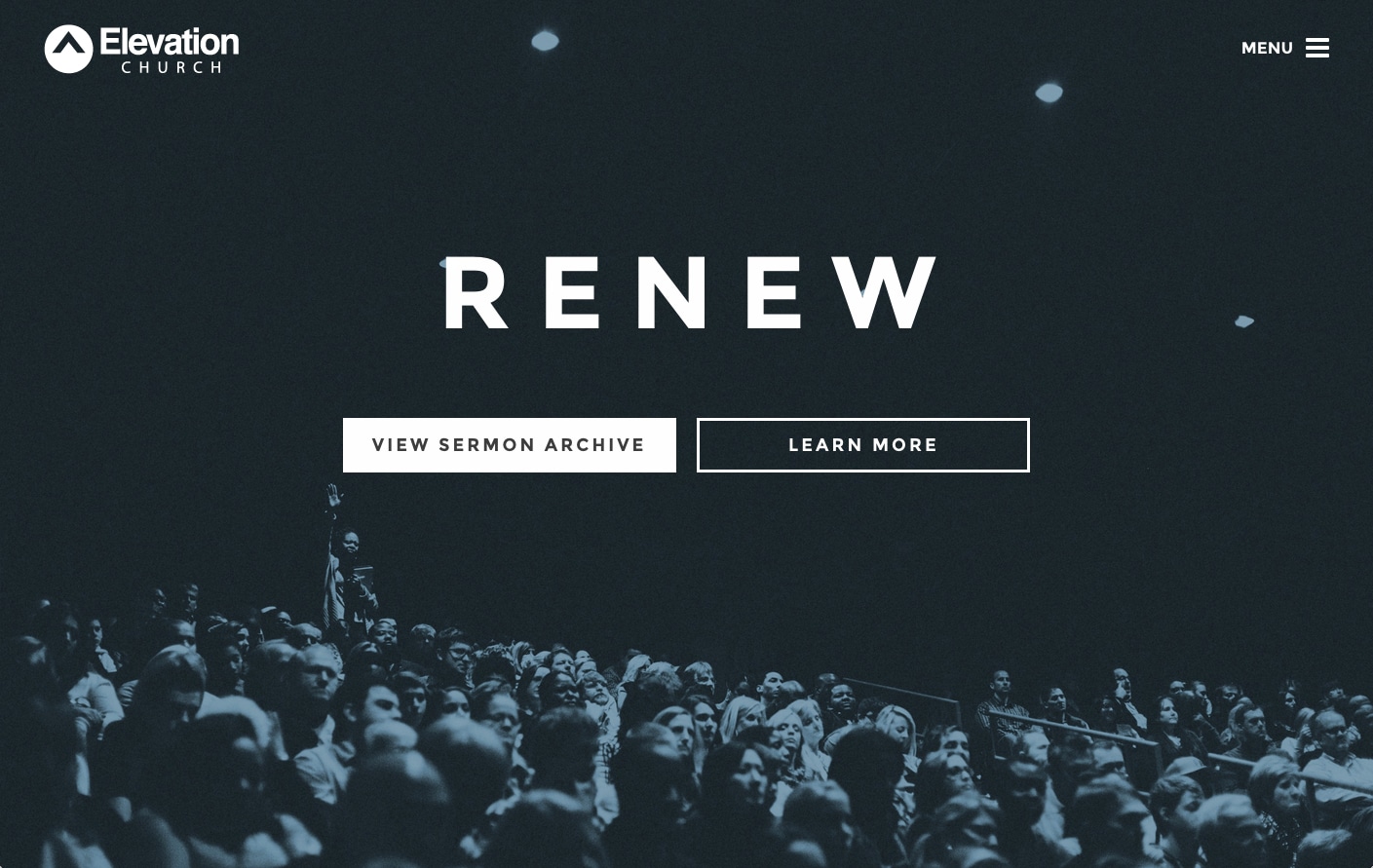
When you first arrive at Elevation Church’s homepage, you are greeted with a pretty simple and minimal page. There’s a large full-screen background image , a logo, a menu icon, two CTA buttons and a large heading. If you refresh the page a few times, this heading actually changes to one of several positive, emotive words like “hope, love, joy, renew, encourage”. Putting such large words in the centre of the page like this draws the user’s attention to them and gives them information about what the church is about. Using these sort of words connects the church to the user and gives them something emotional to connect with. The power of these words automatically causes the user to be engaged with the page. The background image shows a church that is full of people of different races.
At the top right corner of the page is the menu icon which opens up an off-canvas sidebar style menu. Within the menu is a list of common places to go to within the website along with links to their social networks and an embedded video of their latest sermon. The menu features some nicely designed icons; if you hover over the close icon you get a lovely little animation!

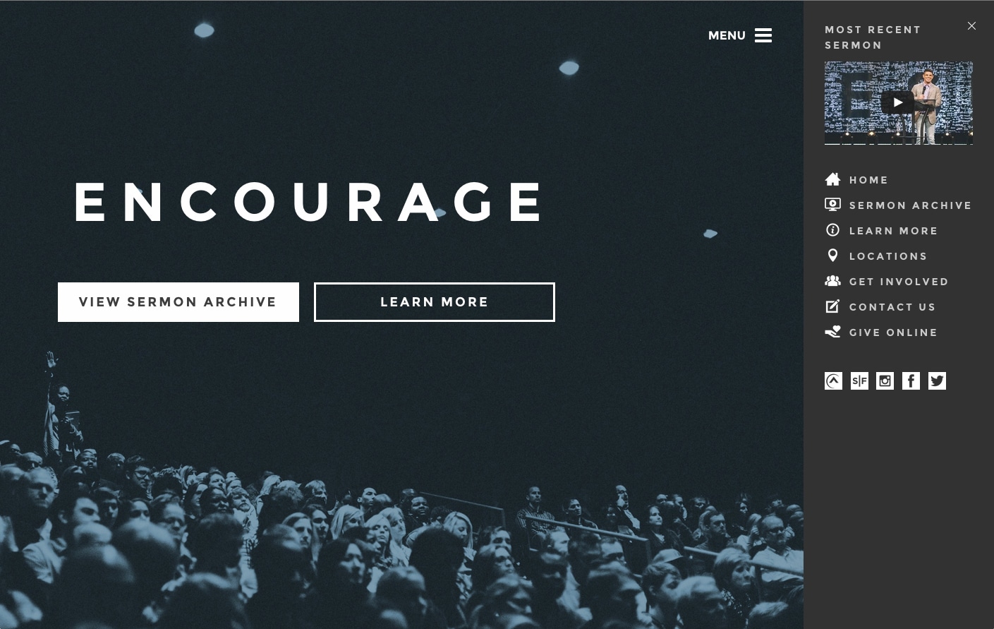
The homepage features two big CTA buttons that take the user on two different journeys through the website. One button takes them to the sermons section of the site, where they can watch a large number of videos of preaches etc. This is likely to be the most popular place that users visit on the website and a decision to include this button on the homepage was probably made based on analytical data of website conversions and navigation by users. I would imaging that for church members, the sermons are the most common thing they would look at on the website.
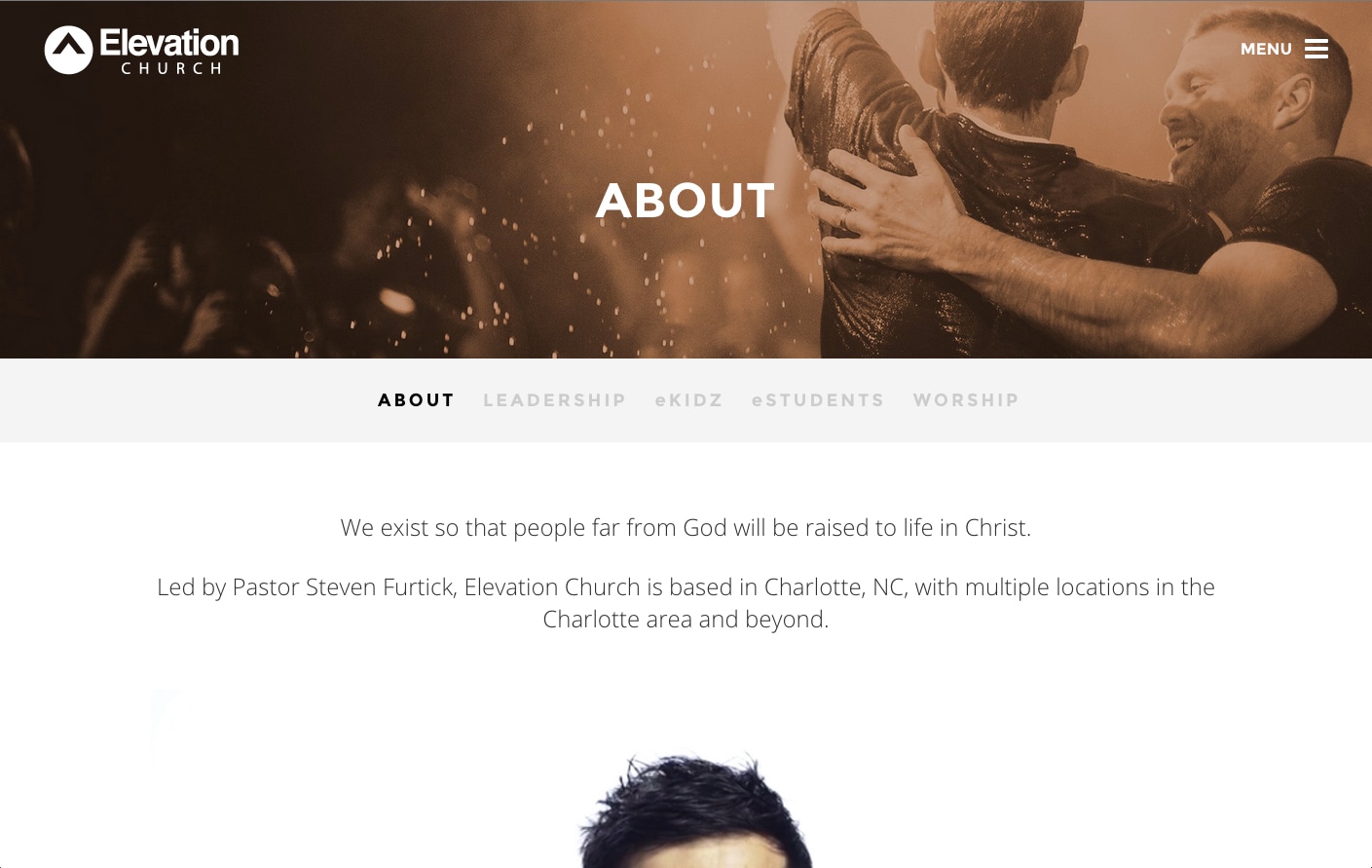
 The other link on the homepage ‘learn more’ takes the user to an area with lots of information about Elevation Church. It includes a nice welcome video, a tabbed area containing the most relevant content and some nice imagery. Tis area is most likely to be visited by non-christians or visitors to the church. Placing a link to this area on the homepage is a smart move – targetting these sorts of users and makign sure there is a clear path for them to take once they arrive at the website. A great user experience!
Elevation Church clearly understand their website audience and have done their research in order to present a homepage that works for them and offers clear decisions for the users to make. Not only have they presented us an easy to use website with a great user experience, but it is obvious that they have paid attention to current design trends, popular font styles and made use of a sense of intrigue; presenting little information on the homepage cleverly causes the user to want to find out more and giving them the two CTA button options in such an obvious way gives them a gentle push in the right direction. Well done Elevation Church!
Let us know what you think of Elevation Church’s homepage in the comments below.
Update!
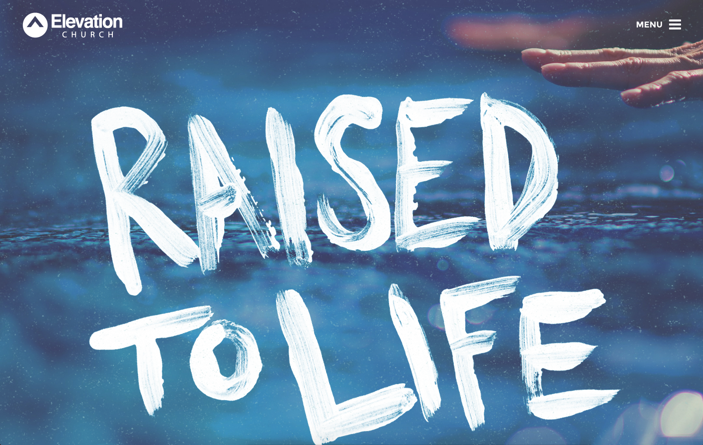
Since writing this post, Elevation Church has decided to update their homepage! We now see a big ‘back to life’ phrase across the screen with an image of some water, suggesting baptism. The page is now even more minimal, but still as impacting. There are no links on the page, but the user is still left intrigued to find out more.